


The opening of a supermarket is rarely the subject of much remark. This is principally because so much of what is done in today’s customer-driven store design is incremental, rather than a wholesale reinvention of the cheese or deli counters, for example. Perhaps this line of thinking also leads to the kind of complaints that surface from time to time about our towns and cities morphing into more or less the same place. But look closely and there are significant differences between stores.
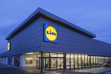
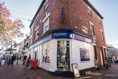
Near St Albans, London Colney’s retail park – a destination easily reached only by car – is a case in point. Last week, Sainsbury’s reopened its store there, which, at 85,000 sq ft (7,895 sq m), is the grocer’s largest refurbishment and new-build to welcome shoppers this year, according to Sainsbury’s head of store design Sarah Batkin. From the outside, it bears a resemblance to many edge-of-town units, although, in fairness, there is a degree of architectural finesse about this one that many others lack.
Sainsbury’s at London Colney used to be a Savacentre. The site has been split into two units and to the left of the new Sainsbury’s now stands a Marks & Spencer, complete with the requisite Plan A eco-friendly messaging in its windows. The two retailers share a canopy, creating a distinctive frontage, if only because of the different corporate branding treatments that have been applied.
Interestingly, M&S is not alone in taking the moral high ground with its green-tinged corporate social responsibility agenda. On the right, Sainsbury’s has posted a series of graphics along the front of the building with information relating to health, community and the environment. There is also what Sainsbury’s store design manager Damian Culkin refers to as a “sunburst” graphic on the exterior of the entrance, drawing shoppers in with the promise of products and services they might not expect to find in a supermarket. Among these are “clothing and home”, “dry-cleaning”, “travel money” and a Starbucks.
The latter is a legacy from the old incarnation of the store and sits cheek by jowl with Sainsbury’s own café on a new mezzanine level. Both are reached by a staircase just inside the glass and steel atrium that forms the entrance to both Sainsbury’s and M&S. It is at this point that things begin to look different.
Café culture
The signage for the Sainsbury’s eaterie takes the shape of a cup and saucer contrived from the letters that form the word café. It’s a neat design solution and is symptomatic of much of the in-store vision, where the workaday has been revised to give it a fresh aspect.
It’s worth visiting the café to try one of the fruit smoothies, which, along with its range of coffees, are cheaper than those Starbucks has to offer, according to Culkin and Batkin. Clearly a healthy competitive instinct exists between the two organisations; the smoothies taste good, too.
As well as giving high levels of natural daylight, the perimeter walls of the café are covered by a rich, red-orange design, which, while it is obviously in keeping with Sainsbury’s branding, avoids the trap of looking over-corporate.
Back downstairs, the main entrance to the ground floor is filled with kiosk-style offers. The cigarette counter (some people do still smoke, apparently) is followed by a sandwich and healthy snack chiller cabinet. Along the top of this are a series of off-white icons set against a taupe background, showing objects such as apples, forks, cakes and sauce bottles. These have been taken from the packaging used for the sandwiches, creating a sense of consistency of approach, according to Culkin. The cabinets themselves look like a cross between EAT and Pret A Manger fixtures. Culkin acknowledges the influences, saying that it is about presenting a credible high street-style offer.
There is now a choice: general merchandise or food. Sainsbury’s has put its best foot forward at its London Colney shop, which has its biggest general merchandise footprint to date, covering 25,000 sq ft (2,325 sq m) of the 85,000 sq ft (7,895 sq m) ground floor. Clearly the grocer is pinning its hopes on the success of its general merchandise and there is a large selection on offer. Clothing is at the front, with womenswear first, then children’s clothing, followed by menswear. Culkin says the reason for the layout is simple: “80 per cent of our customers are women, so it makes sense to put the offer for them at the front.”
In the men’s area, the display units are arranged in a hierarchical fashion, with four-way units displaying low-priced jumpers at the front, giving way to taller units deeper into the department.
Sensibly, given that the male attention span when shopping for clothes is famously brief, the menswear department is located next to the TV and digital gadget department, in front of which are gondolas stacked with video games and DVDs.
Putting a digital photo lab alongside the TVs, DVDs et al is a first for Sainsbury’s and does a good job of creating a destination area. At this point, you understand why the trolleys that shoppers are pushing around look bigger than usual. Culkin says that the majority of people visiting London Colney’s retail park will have travelled some distance. This qualifies it as a destination in its own right and buying bulkier goods will be the norm, making larger capacity trolleys a requirement.
A final highlight of the general merchandise area is the cookshop. Here, a suspended white raft embedded with spotlights throws light onto a kitchen set with shiny, stainless steel pans and the kind of tiled worktop that only those with money to throw at the culinary arts will be able to afford. The strange thing is that, although this looks upscale, it is immensely affordable – a happy combination of price and style.
In the food area the sheer scale of the space alone is notable. Much has also been done to change the normal Sainbury’s appearance, while creating something that is easy enough to take elsewhere. From the ready meals with graphics of their ingredients to the “Special selection” with a photograph of a Japanese garden, there appears to be a pictorial representation for every department.
The majority of these are backed up with words about provenance, quality and the like, creating an upmarket feel. The Special selection, in particular, serves as an example of how new merchandising techniques are being put in place. The “Taste of Japan” strapline sets the scene for a series of shelf-edge labels that explain what some of the products are, what they should be eaten with and, in a number of cases, how they are made. There is a sense that what you see really is what you will eat and overcrowding on the units has been studiously avoided.
A mention should also be given to the fresh fruit and vegetable area, where all products are arranged on wheeled units, which can be replaced at the drop of a lever and with a bit of manpower. Sainsbury’s design team, which worked with consultancy Twelve to create the blueprint for this store, has developed a store interior that looks very familiar, but which has much that is different.
“In terms of our remit, it’s about delivering things that we think have the ability to roll-out as part of our store development programme,” says Batkin. While this may sound a little like Sainsbury’s-speak, it is exactly what has happened at London Colney and the store is all the better for it.
No comments yet