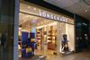
Most developers can bring in the high street’s big retail names, but the addition of small stores can make a shopping centre stand out.
Prime is prime and it’s the little things that count. These two aphorisms might, with some accuracy, be applied to Westfield London at the moment. There are few shopping centres that are fully let at present, but a quick walk around Westfield reveals just one vacancy. That is the unit that was previously occupied by failed retailer Jessops, and the administrators have closed it.
The plain fact seems to be the same as it has always been - if a centre is at the nexus of a well-served communications network and has an affluent catchment, then the chances are good that it will thrive in spite of what’s going on elsewhere.
But there is rather more to shopping centre success than just being in the right place. A scheme also has to have the right offer.
And while it is certainly important that appropriate anchors are in place (there is speculation that John Lewis is on the verge of signing to open a store in the extension to Westfield London, work on which is set to begin in 2014) - House of Fraser, Marks & Spencer and Debenhams have all been here since the development opened in 2008 - there is more to getting it right than big stores.
Although it is useful to have all the familiar high street names within one climate-controlled interior, it is the smaller stores that are likely to colour the shopper’s view.
For such a large scheme, brimful of flagship stores, it is often the more diminutive offers that are going to make the onlooker think that this is more than just another mega-mall.
It also seems to be the case that it is at the smaller end of the Westfield retail scale that most action seems to take place, with new names appearing almost every time a visit is made. It is this kind of dynamic that makes a mall worth watching.
Longchamp

The Paris-based leather goods retailer and brand opened up shop in Westfield in mid-2008. In doing so, it joined a raft of upscale names with a store where the visual merchandising of its brightly coloured wares is, for the most part, set against a neutral background.
The windows use just three colours - a royal blue backdrop for bright yellow and coal-black handbags. The same is true of the interior, where the colour scheme is kept tightly controlled around the perimeter, with the exception being a module at the back of the shop where the same bag, in seven different colours is run from floor to ceiling, seven-high. This is all simple stuff, but is much the better for it.
Kate Spade

Mid-price luxury brand Kate Spade has quite a lot in common with Longchamp in terms of the well-heeled demographic that it seeks to attract, but it feels almost completely different. From the full length window decal, depicting a shift dress-clad 30-something woman, to the interior with its white walls to which a bright orange floral pattern has been applied, this is about confidence rather than contemporary conservatism.
The handbags, because this is what Kate Spade is principally about, are contained in internally-lit white niches along the back wall and open-fronted wardrobes along the left and right-hand side perimeter walls. And again in contrast to Longchamp, the store interior might be brightly coloured, but the stock is relatively neutral in tone.
In both stores it’s about providing an appropriate setting for the products that are on offer.
My London Girl

Veteran New York retail watchers might notice a similarity between American Girl Place and this store.
And, as in the world at large, in retail it really does take all sorts and if you want to dress as if you have just stepped out of a fairy tale, then this is the place where you will be able to do so.
As this is an open shop-front and the window is therefore the store interior, the visual merchandising message is that you are entering an Alice In Wonderland vignette - which probably accounts for the black and white tiling, the chandelier and hot pink perimeter wardrobes.
My London Girl is certainly a niche offer and will not be to the taste of every consumer wandering through Westfield London, but it is a strong example of what makes a shopping centre different from its rivals.
Whittard of Chelsea

Like so many of the other small shops in Westfield London, this is a niche offer and in this instance it is the epicure that is targeted. This is done by making the most of the store’s position with a glass curtain wall that wraps around the corner, giving almost 270° views into the shop. And what is on view is a store that combines
minimalism with a white, wood-clad rustic feel.
Practically, this allows the predominantly duck egg blue tea caddies to shine out at the passer-by. A plain wood planked floor completes a look that should appeal to those in search of a simpler time when shops were staffed by aproned types of the kind some might remember as personified by Ike, the shopkeeper in The Waltons.
Zara

By way of contrast, one of the high street’s big beasts put its design foot forward when the centre opened in 2008 with a fascia that has been repeated nowhere else.
Whether this is good or bad is a moot point, but this, like many of the smaller shops, is a one-off.
It is also worth looking at for Westfield London’s most stripped-back store windows. No stock, no mannequins and not even a hint of red permeate the two large windows. Instead, shoppers are treated to a white screen, supported by a pair of scaffolding poles, on which the word “Sale” has been printed.
While this will certainly have been low cost to effect, it is also highly effective. Sometimes even the largest players can do something that genuinely surprises.
Thomas Pink

Thomas Pink is part of the LVMH group and as such you’d expect it to aspirationally priced. It is, and among the men’s shirt sellers that are found in the centre - think Hawes & Curtis, TM Lewin and suchlike - this is at the top of the tree.
At the moment what really marks it out is its window, which has one of the most arresting arrangements in the whole of the centre.
It is a 2D affair, featuring cardboard bengal stripe shirt fronts and is in many ways reminiscent of what was done with plain shirts in Louis Vuitton stores in 2012.
There are lots of them and they feature coloured stripes. This is one of the more low-cost and straightforward windows in the centre, but it would be hard to walk past and not pause, for at least a few moments, to admire the chevron arrangement and the “Bengal Stripes” strapline.
Bill Giouroukos on getting the right tenants

“If you don’t make mistakes, you aren’t doing anything and this is not an exact science.” Westfield operations director Bill Giouroukos is clear that while bringing a new brand or retail format to a shopping centre is a good idea, sometimes consumer resistance can prove inimical to making something work and ultimately it might be time to call it a day.
Citing Coach and Gilly Hicks as successful UK “firsts” in Westfield London, however, he makes the point that it’s a matter of going out there and seeking brands that might prove attractive to UK shoppers and being ahead of the rest of the pack in doing so. “You should never be arrogant enough to assume that people will come to you. If they’re not talking to us, then we should be out there talking to them,” he says.
Likening filling a shopping centre to laying out and merchandising a shop, he emphasises the importance of adjacencies. “You have to create a space that is cool and that people will want to come to,” he says. In shopping centres, the science of generating sales for both landlord and tenant comes down to a constant reevaluation of the offer and a willingness to admit that things might have to change, according to Giouroukos.


No comments yet