


The eye-catching windows of London’s shops often look their best at night. John Ryan visits retail displays others can learn from.
Visual merchandisers spend hours and sometimes days creating their displays and yet, owing to a combination of bright sunshine, with the inevitable reflection, and perhaps an overload of visual stimulation, their efforts occasionally go almost unnoticed.
Late summer or early autumn however is a good time to see window displays at their best. As the evenings draw in, but temperatures remain clement, a stroll along Oxford Street and Regent Street allows the art of the visual merchandiser to be seen at its best.
At present what is apparent is that many retailers have gone back to basics when it comes to decking out their windows, with the emphasis being placed firmly on the stock rather than the elaborate scene-setting that sometimes characterises the efforts of many in London’s West End. This may of course be to do with the aim not to spend too much money on displays but, equally, the pared-back quality of many windows means that the schemes can be taken beyond London’s West End and the brand appeal extended beyond the M25.
With a few notable exceptions, generally what’s happening in mass-market windows at present is less visual trickery and more direct and merchandise-led simple appeal.
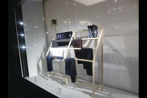
Cos, Regent Street
Cos, the grown-up Scandinavian fascia from H&M, succeeds in offering shoppers an even more minimalist version of simplicity than John Lewis.
A triple-tiered, bare wood frame, over which clothes are draped, is set within a white box window. It is hard to see how this might be reduced further, short of presenting shoppers with an empty box.
However, perhaps because it is so unadorned, the window was causing those heading south from Oxford Circus along Regent Street to take a second look.
It also puts the store in line with the brand ethos, which is about not being bright or flashy but offering instead a clean-limbed Nordic aesthetic.
There is something of the emperor’s new clothes about what’s been done here, but it’s effective.
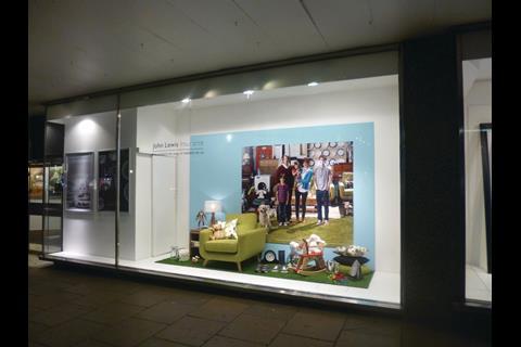
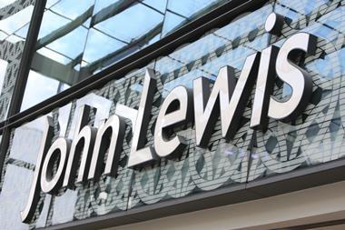
John Lewis, Oxford Street
Time was when John Lewis belonged perhaps to the Andy Warhol school of display where the modus operandi was to take a single object and then repeat it in multiple colours.
This meant windows filled with lines of brightly coloured Hoovers or food mixers or almost anything else but, in terms of making passers-by stop and stare, they were not the most compelling.
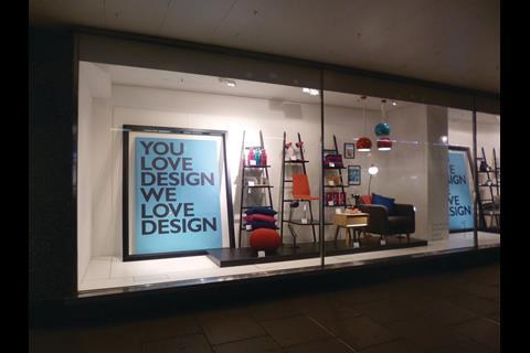
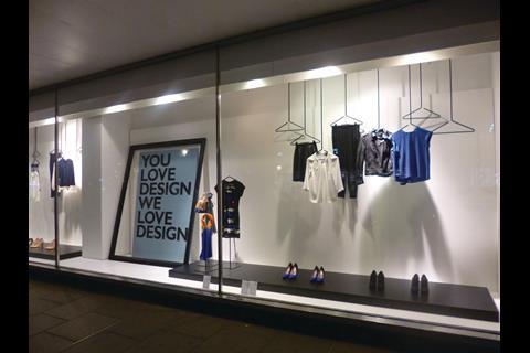
Times have changed and now the legend that accompanies the windows along the front of the Oxford Street flagship reads: ‘You love design we love design.’
This message is contained within a floor-to-almost-ceiling black frame and the rest of the window backdrop is white, leaving the stock to do the talking.
For this to work, the stock has to be in loud colours and there should not be too may of them, which is what the John Lewis VM team has done. In spite of its extreme simplicity, this is one of the street’s more compelling displays.
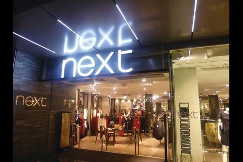
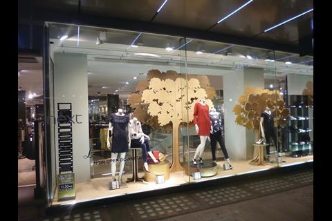
Next, Oxford Street
As one of the stalwarts of the mid-market, Next’s windows have to be modular, but it is also essential they are capable of being rolled out across a very large estate while retaining passer-by appeal.
The solution provided at present is a plain plywood forest consisting of 2D trees that offer a neutral setting for some relatively simple pieces of women’s clothing.
By the standards of what has been done in John Lewis and Cos this is almost complex, but it still falls within the minimalist term of reference that seems to be the order of the day.
It is also a cost-effective display, capable of being installed quickly and easily by the store team - another prerequisite for a large, mid-market retailer.
Unlike Cos or John Lewis, this store does not use boxed-in windows, meaning that shoppers can see beyond the display into the store.
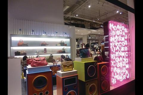
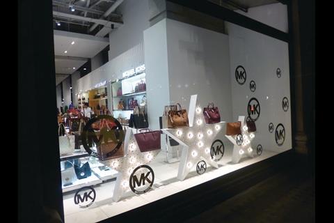
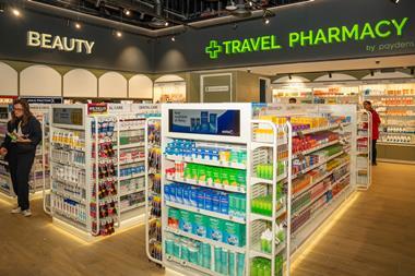
Selfridges, Michael Kors window, Duke Street
Sometimes windows can be used to good effect simply to let shoppers see what lies within the store and, when the interior is as carefully crafted asthe young fashion area in Selfridges, this is an obvious strategy. This window is about letting passing shoppers get a look at the offer from US brand Michael Kors and framing the view with bags, internally lit 3D stars and the MK logo.
Only the lowest third of the window is actually used to show off stock because anything more than that would mean obstructing the view of what’s going on in the shop.
And, given that the shop-in-shop that has been installed for the Michael Kors area is about glitz, there seems little need to do more. Selfridges has relatively few unboxed windows, this is one of the better ones at present.
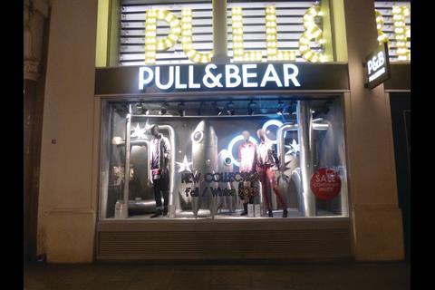
Pull & Bear, Oxford Street
The curiously named fascia is one of the exceptions that proves the minimalist rule along Oxford Street at present.
This is a window that has a highly elaborate backdrop featuring a retro 1950s sci-fi rocket, silver stars and a lot of silver pipes that run up and down and across the scheme.
Wisely, given the busy-looking nature, the window sticks to a silver palette, although quite what this has to do with the arrival of the new autumn collection is hard to fathom.
It has the merit of appealing to the eye because it is so different from what any other retailer on Oxford Street is doing at present.
And, perhaps because there are so relatively few Pull & Bear shops when compared with stablemate Zara, the biggest of the Inditex brands, it is obvious that more money has been spent on this installation - because it is unlikely to have any meaningful effect on the bottom line. However, it is the sort of thing that might be difficult to replicate on a mass scale.
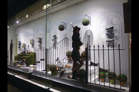
Clarks, Regent Street
At its Regent Street flagship, Clarks uses a monochrome theme with a window backdrop that is a line drawing of two London house fronts.
It also features 2D standee cutouts of a male and female, who look as if they are about to head off for a night on the town.
A monochrome dog sits on the steps of one of the houses while a cat is outside the other, and somewhere amid all of this there are the shoes, all of which are neutral or black.
There is so much happening in this window that the stock might be in danger of being overwhelmed and, although the purpose of a display is to make shoppers look, it should also be about making the merchandise stand out.
In this instance the careful control of the colours means that even the shoes’ neutral palette shines out. Clarks needs to do more of this elsewhere.


No comments yet