A small area in the centre of San Francisco has all of the major US brands that characterise the country’s retail activity. They are also where US retail puts its best West Coast foot forward. By John Ryan
Downtown San Francisco is like a retail theme park for all your favourites. Within 100 metres of Market Street, at the heart of the city, you’ll come across Gap, Urban Outfitters, Bloomingdale’s, Anthropologie and Forever 21, among many others.
It also serves to show the way in which the US has colonised UK high streets over the past 20 years. Hardly any of these names have the glamorous cachet that might once have been the case and now merely seeing these retail fascias is rarely sufficient to quicken the pulse.
That said, this is San Francisco, a major West Coast tourist destination and the crowds that flock the streets in these parts are a cosmopolitan bunch.
Perhaps for this reason, the retailers that operate here are more than a little different from what you tend to come across when inspecting the same names in the UK, or the rest of the US for that matter. And much is done to emphasise the fact that they are commercial residents of this city, with a sense of place being stamped on almost every shop.
There is also the fact that this is home territory for retailers such as Gap and Levi’s, which again means that a retail show is on the cards.
Add to this the fact that in the week that Westfield opens in Stratford, this city has had a shopping centre courtesy of the Australian developer for half a decade this month and this is one of North America’s most important retail destinations.
Anthropologie
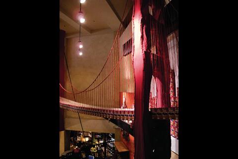
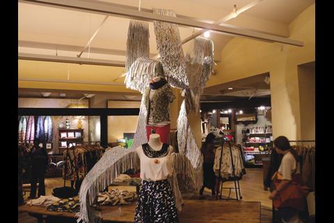
If there’s one image that sticks in the mind when the name San Francisco is mentioned, it’s the Golden Gate Bridge. This orange/red structure has been around since the 1930s and is visual shorthand for the city built around a bay. With this in mind, Anthropologie has installed a version of the suspension bridge constructed entirely of Rice-A-Roni packets.
The latter, in case you were wondering “combines rice, pasta and the perfect mix of seasonings”, but this is hardly important other than as the building material for this outsize visual merchandising installation.
Anyone with a passing familiarity with Anthropologie will be aware that homespun displays are part of its DNA, but what has been done in the San Francisco store is more than the usual matter of allowing a degree of local autonomy when it comes to individualising the store. This shop is currently worth a visit purely on the basis of making much of its local attraction.
It works here, but imagine a scale model of St Paul’s constructed from, say, Alpen packets and then placed in a prominent position in an Marks & Spencer store. It might be a stretch.
Urban Outfitters
Most people are aware that Urban Outfitters is the same company – albeit a different brand with a younger target audience – as Anthropologie. They both share a love of the handmade and artfully industrial when it comes to creating interiors, windows and visually merchandising the stock. But although they come from the same stable, they are nonetheless discrete.
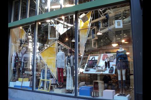
This is illustrated by the current Urban Outfitters window display in San Francisco. This is perhaps best described as a series of scaffolding poles bolted together in a seemingly random fashion with planes of coloured canvas strung between them. Mannequins are then placed on box plinths in front of this and empty picture frames are then located at the base of the plinths. To complete things, a runner rail of jeans on hangers is then added to the mix. All in all, it manages to achieve what may be the desired effect of a measure of chaos – which is some distance from the controlled and well-mannered interior offered by Anthropologie – altogether more grown-up. Both, however, demonstrate a very keen awareness of whom they are selling to.
Bloomingdale’s
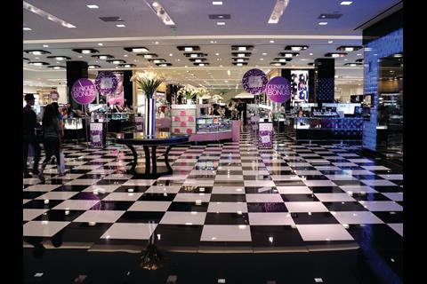
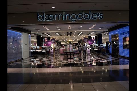
Located within Westfield San Francisco, this is one of the mall’s two anchors, the other being rival department store Nordstrom. For sheer grandeur, however, this one has the edge from the moment an approach is made. The high-gloss chequerboard floor is left almost bare at the entrance, leading the eye deep into the store, where the beauty department begins.
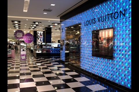
This is framed by the Louis Vuitton shopfront, on the left-hand side, which is formed of large lights that shift colour constantly and which also features items from the eponymous luggage range supported on golden stork legs.
The whole effect is about impressing the shopper and it works insofar as it’s difficult not to take a look at what’s going on beyond the gaping open front to the store. The store’s strategic position at one end of the mall means that it can be viewed from almost any point along the entire length of the mall’s interior.
Old Navy
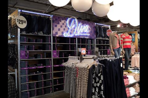
As the budget end of Gap Inc, you’d expect the value message to be made pretty clear when you enter Old Navy. It is, with signage everywhere shouting ‘Clearance’ or multi-buy bargains. That said, what really marks this one out is the budget graphics that look like the front of soap powder packets and the moving sportswear display.
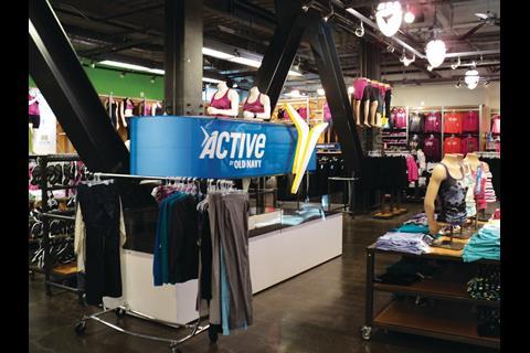
When it comes to movement, most retailers currently veer towards the digital, rather than the mechanical, typically with a screen that will change colour, show a video-clip, or some such. In keeping with the low-cost nature of the brand. However, Old Navy opts for the clunkily mechanical when it comes to making the most of its men and women’s sportswear.
In-store mannequins are surrounded by a banner that rotates, thanks to two revolving drums at either end of the displays, allowing the message ‘Active Old Navy’, printed on the banner, to circulate endlessly. It’s very low-tech and absolutely on brand for the retailer. It also has the benefit of making you stop and stare, which increasingly, digital displays do not.
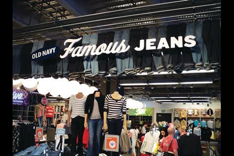
Downstairs, the overhead display of ‘Old Navy Famous Jeans’ is also eye-catching, located just in front of the supermarket-style checkouts. It is hard not to wonder why Old Navy has never made an appearance in Europe.
Forever 21
With three large Forever 21 stores now up and running in the UK, the format of the store on Union Square is familiar. However, it does show what is possible if you start with raw materials that are better than those that were available in either The Bullring or Oxford Street.
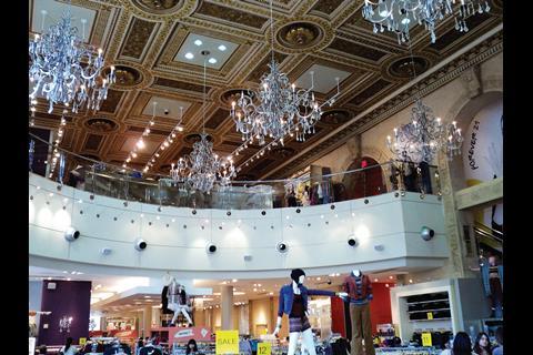
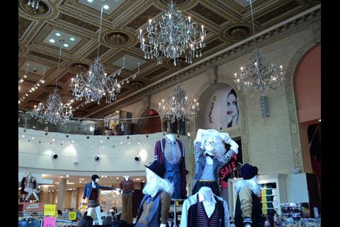
This large branch, with its dramatic mezzanine, benefits from having been a major bank in a former life. Practically, this means that the major selling point of the interior is overhead. What greets the shopper is an early 20th century imitation of an Italian Renaissance panelled and painted ceiling and Forever 21 has had the good taste to suspend multiple chandeliers from this, adding to the distinctly grand but glitzy feel.
The chandelier and ceiling both provide a stark contrast to the brightly coloured stock and displays. Noteworthy too is the respect that has been afforded to the fabric of the building where the niches in the plain stone walls have been used to good effect as display features in their own right. Not so long ago, many retailers would have been tempted to cover all of this in an effort to stamp their own authority on a space.
Gap
The Gap on Market is almost to Gap Inc what the Marks & Spencer store at Marble Arch is to Britain’s mid-Shires favourite. This is a format and visual merchandising laboratory and the chances are good that what’s on view here will eventually permeate its way across the estate.
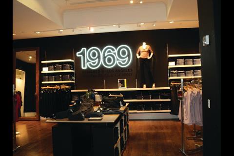
And it does make interesting viewing. Asked to describe a Gap store, most shoppers will mention the overwhelming predominance of white on the walls. Not so here, where much of what’s on view is housed within a series of rooms where the walls are painted a dark taupe. Things are lightened a little by the use of white neon tubes in the womenswear department on the ground floor, fashioned into ‘1969’. Nevertheless, this is an altogether more sombre interior than most Gap shoppers will be accustomed to and perhaps indicates a change of design mood.
Worth noting too, is the use of an inverted bicycle as part of a display in the men’s department. As props, bikes are everywhere at the moment – helping to strike a green note.
San Francisco
Distance from London 5,371 miles
Ambience West Coast tourist centre
Retail design At every turn














No comments yet