


Victoria White, shopper marketing planner at TMW shares her view of good and bad sites
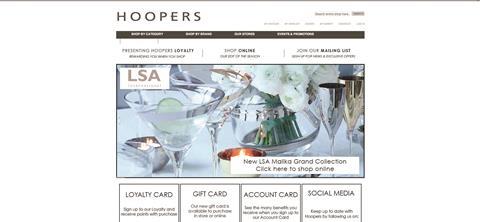
Hoopersstores.com
The home page of luxury department store Hoopers is almost as enticing as its beautiful window displays.
The site offers an easy shopping experience. Not all of its offer is available but this is clearly explained in an online edit by the buyers.
There’s also a clever feature around comparison, where products can be added to a ‘comparison list’ so that shoppers can view products and their key features side by side before making a final purchase.
Overall, it’s beautiful and brings the in-store experience to life, enabling the shopper to have an integrated retail experience.
Fenwick.co.uk
By contrast, the home page of premier department store Fenwick feels very flat and does not invite the user to shop.
On clicking through to each of the different departments, the choice of products on offer seems to be very limited. Unlike Hoopers, this left the impression that Fenwick doesn’t really want to provide an online offering.
In addition, the goods are displayed in a very muddled way - a £59 T-shirt displayed next to a £799 dress, for example. More thought about actual shopper behaviour would do a lot to improve this site.


No comments yet