


Julie Dodd, head of user experience at digital marketing agency Zone, shares her views of good and bad sites.
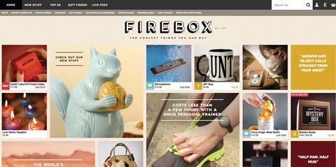
Firebox.com
The recently redesigned Firebox site is well optimised for mobile use, with a beautifully responsive design that’s as good on the small screen as on desktop. Its search function dealt deftly with my clumsy mistyping to give me an attractive display of results.
Product pages prioritise crucial product information but offer plenty more detail if you want it, and every step of the checkout process is clearly laid out and easy to use.
Vitally, Firebox doesn’t force you to create an account to make your purchase - a mistake that many retailers shoe-horn into their checkout journey, which damages conversion rates.
ThePresentFinder.co.uk
In contrast, the Present Finder purchasing experience is a bit depressing.
The desktop site isn’t dreadful but it is very cluttered and bombards you with irrelevant promotions. The whole website is desperately in need of some design love.
There is a mobile version but it is not responsive. The design is just as busy as the desktop version but uglier and the buying process is clunky - it felt like I was filling in the form for hours.
UK consumers now buy more gifts online than on the high street, but there is clearly a huge contrast in terms of which retailers are doing this well.


No comments yet