


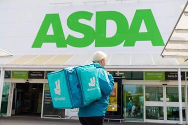
As snack foods retailer Graze ditches its brown packaging in favour of a new vibrant rebrand, chief executive Anthony Fletcher insists it is important to keep branding moving.
I’m sure everyone can agree that having a distinctive and memorable brand is up there as one of the most valuable assets a business can have.
However, they often seem to have a bit of a ‘half life’ with competitors replicating your brand or consumers no longer viewing you as quite so original over time.
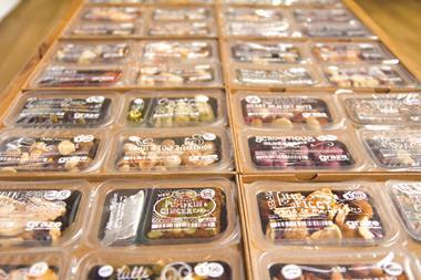
Graze did a good job 10 years ago, when its distinctive brown boxes started turning up in offices across the country.
Our boxes were pretty unique back then, with their beaten brown card showing that we cared about where our packaging came from and what consumers did with it once they were done.
The novelty of receiving snacks through the post, along with the excitement of opening a new box, created a positive user experience for our ‘grazers’ and served the business well for nearly a decade.

However, over time more and more health brands began entering the market. Some were not particularly imaginative in their approach, while others simply used the Graze model as a short cut in attempting to achieve their own success.
When we launched into retail in 2014 we continued with our famous ‘brown’ theme on shelves. This method was key to ensuring consumers understood that the online and retail brands were connected in a new environment.
Just weeks after entering the market sales exploded and we became the number one in our category across several key retailers.
Having built a strong reputation online, consumers were comfortable buying our products in retail when they spotted the familiar branding.
However, at the same time, nearly everyone in the health market was starting to look the same. The same hand drawn feel, the same use of natural colours – even the use of whimsical cartoon-esque imagery was being imitated across products.
We had a hunch that we were losing our distinctiveness and so we decided to appoint creative agency Jones Knowles Ritchie to do something about it.
Coming at it with fresh eyes, they pointed out that if you squinted in the direction of the health snacking aisle in a supermarket would Graze really stand out? Was the brand still unique, or was it near enough the same as everyone else?
A complete overhaul
So after nearly a decade of the brown, we decided it was time to overhaul our branding.
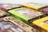
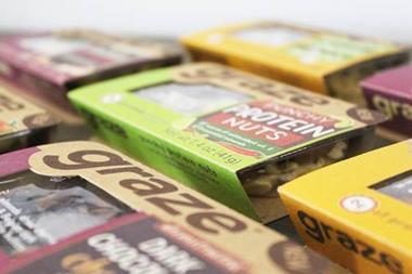
We knew the market was still missing a sense of excitement so we decided to opt for vibrant colours to emphasise the taste and freshness of our products.
Though an exciting change, it did mean ditching our trusty rustic theme – one of the most consistent assets that we’d depended on for almost a decade across hundreds of millions of boxes.
“In this market it is important to remember that brands rust. As an innovator in the industry, this was never an option for us”
Worryingly, this wasn’t something we felt we could use our usual approach to derisking for big decisions through A/B testing. We carried out market research, but whether this can really be relied on for such big decisions is a commonly debated trend in the industry.
Ultimately, the decision came down to our own convictions and we resolved that the brown had to go.
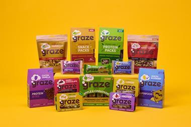
We’ve spent the last eight months updating over 400 SKUs, hundreds of web pages, various email templates, office ephemera and all our advertising assets.
The new range recently started to appear in stores and we’re pretty pleased with how it looks. The question is: are sales actually going to go up as a result? And if they go down, would we contemplate changing back? Were short-term sales even the point of making the changes in the first place?
Either way, in this market it is important to remember that brands rust. However, as an innovator in the industry this was never an option for us and that’s why we decided to go with our gut and move with the times – what will come of it? Only time will tell.


No comments yet