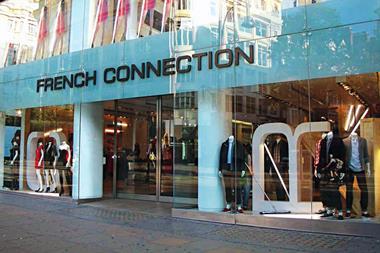
French Connection's losses may have shrunk in the six months to the end of July, but by no means is it out of the woods.
In light of recent financials, French Connection's commercial team will be looking to alternative revenue streams that are at present being under-utilised. Could online strategy provide a glimmer of hope for battered shareholders?
Online is a sales channel, not a brand statement
A well-structured homepage is vital in engaging visitors to stay and encourage them to consider a purchase.
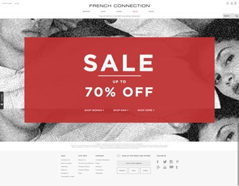
For French Connection, the homepage has clearly been modelled on the very successful Asos execution of a simple ‘get to point’ engagement for the shopper.
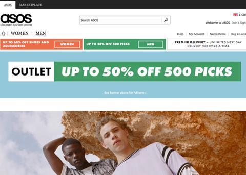
On closer inspection, however, it is a rather poor imitation:
- The Sale pop-up isn’t a link to the Sale – this requires you to click the category of choice.
- Unlike Asos, there is nothing to encourage the shopper to engage further with the sale.
- There is no immediate opportunity to search.
- There is no clarity on delivery, secure payment, etc.
- Where Asos promote product through its imagery, French Connection promote brand.
Lessons to learn
French Connection has, it seems, forgotten the basics of selling, let alone mastered the nuances of selling online. The lessons here are straightforward:
- Consumers who search for something specific are more likely to buy. Hiding search functionality is therefore probably reducing sales.
- Poor signposting disengages customers and reduces the likelihood of them progressing down the funnel to category or product pages. Having a passive pop-up and hiding the scale of opportunity and the benefits of Sale shopping reduce the flow into the next stages of the sales funnel.
- Unfamiliar shoppers expect to understand the core elements of the service proposition, and this is even more so in the highly competitive fashion sector where ‘fulfilment tomorrow’ is becoming standard among the value and high street brands. Failing to reassure on this will be reducing the numbers of consumers who move past the homepage.
Things to test
- Getting the search bar clearly into the page header.
- Improving the Sale benefits copy on the pop-up and making it clickable.
- Selling the benefits of buying from French Connection (delivery contract, etc) on the home page.
Still can’t find what you’re looking for?
By placing the weight of success on the navigation of the website, it is important that the execution is of the highest quality.
After searching for t-shirts, the customer is greeted with an overwhelming list of filtering options.

On further exploration, the ‘product type’ filtering option – at the top of the list – expanded into a choice of over 50 different types.
Has the retailer really thought about the customer at all? Who is going to choose between 50 different types of t-shirt?
I suspect that these options are there to suit the back-end functionality of the website, as opposed to the experience of the customer.
An unempirical poll of shoppers in the retailer's target demographic suggested none were bothered by the difference between ‘Sale’, ‘Sale new in’ and ‘Sale preview’ – they just want to buy a T-shirt.
Lessons to learn
Findability is the most critical thing to get right in any online sales environment.
There is no way in a physical store that anyone would sort t-shirts – or anything else – in this way, so why do it online?
- Filters are there to help shoppers find things. They need to reflect how customers shop. Failing to do this will result in losing sales.
- Filters need to be simple and in a language a shopper would use when describing what they are looking for to a shop assistant.
- Using stock control system descriptors and listing categories in one long block will make it more difficult for shoppers to find what they are looking for.
Things to test
- Take a look at how any of your major competitors help their shoppers find products and test a few of them.
Abandon hope all who enter here
Once the shopper has ground their way through the site and finally found their item, they look to the checkout.
Upon doing so, they are greeted with a sign in page. This suggests an email and password are required to continue along the funnel with no clear guest checkout available.
However, this is not the case. When selecting ‘No, I’m a new customer’, users are able to continue on their journey without the need to register or submit a password.
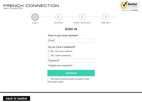
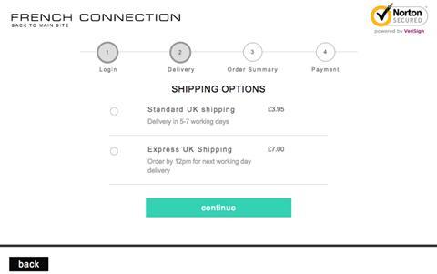
Further along the journey, more barriers become apparent. At the second stage of the process, after entering personal details, the consumer is greeted with the delivery options available.
Up until this point the delivery options have remained hidden, and the customer has not been warned they will need to pay a minimum of £3.95 to receive their chosen goods.
It is only when taking another look at the earlier stages in the execution that the customer realises a free delivery on orders over £50 was available.
Lessons to learn
Frictionless checkout is a significant differentiator of success in basket-to-purchase conversion.
The more barriers put in front of shoppers the greater the chance they will abandon their purchase in the basket.
- Letting customers checkout as a guest removes barriers and helps them purchase faster. Hiding the guest check-in is a barrier that will be driving abandonment upwards.
- Being upfront on delivery and ensuring the shopper knows what to expect means once they reach the checkout they will have either bought more to make the limit or accepted that the item will cost more.
- Being opaque on the delivery contract will frustrate shoppers and either send them back looking for more items, or encourage them to walk away – after all they’ve probably spent more time than with other retailers online finding what they were after.
Things to test
- Try an explicit guest checkout options as the default.
- Put the free delivery offer somewhere prominent at every stage of the funnel.
- Think about an abandonment pop-up or email that helps channel people into the guest funnel and signposts the free delivery.
Now I’ve told you about me, what do you think?
It is good that French Connection is attempting to obtain customer feedback on its website execution.
However, the implementation of this feedback mechanism suggests the retailer is more interested it itself rather than its customers.
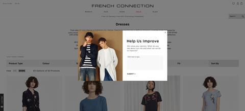
What value is added to the shopper questioning positive and negative website attributes? This style of questioning does not gather the most commercially important information: why did the customer not buy?
There is no incentive for the consumer to help you improve if you do not ask them about their own experience.
Lessons to learn
Insight comes from understanding why customers buy or not. It does not come from asking consumers what they did or did not like about a retailer's website.
We’ve seen many websites people liked that didn’t sell well. In one case customers assumed that a business was out of stock when it wasn’t.
Upon realising this, the retailer changed how it helped shoppers find items – and that meant changing things customers said they liked.
Asking shoppers what happened to them and why delivers an authentic voice, setting powerful agendas that can help drive changes that sell more. Asking for an appreciation of your hard work often delivers far less value.
Things to test
- Surveying differently, reviewing heat and click maps on key pages, running live customer testing and blending this with web analytics to help create predictions that can be used to drive tests that make a commercial difference.
Conclusion
From the outside, there seems to be plenty of opportunities to start turning performance around and becoming profitable once more by improving the online sales execution.
Most of this is rather basic, but getting it right can transform outcomes and accelerate growth.

James Hammersley is the co-author of Leading Digital Strategy. He is a founding partner of Good Growth, and has worked with O2, The Economist, Game, Ann Summers, The Guardian, Barclays, Bupa and Manchester United FC. For more information, visit goodgrowth.co.uk











No comments yet